HDSI Faculty Exploration Tool

Developing an easy to use faculty search tool for the Halıcıoğlu Data Science Institute and its partnering companies.

View our Report Project Github

About

The Halıcıoğlu Data Science Institute (HDSI) at University of California, San Diego is dedicated to the discovery of new methods and training of students and faculty to use data science to solve problems in the current world. The HDSI has several industry partners that are often searching for assistance to tackle their daily activities and need experts in different domain areas. Currently, there are around 55 professors affiliated with HDSI. They all have diverse research interests and have written numerous papers in their own fields.


Our goal was to create a data-centric tool that allows HDSI to select the best fit faculty member—based on their published work—to aid their industry partners in their specific endeavors. We created this tool using unsupervised Natural Language Processing (NLP) methods that entailed of managing all the abstracts from the faculty’s published work and organizing them by topics. We then obtained the proportion of papers of each faculty associated with each of the topics and drew a relationship between researchers and their most published topics. This way, we were able develop a candidate list of professors who specialize in certain topics. This will allow HDSI to personalize recommendations of faculty candidates to their industry partner’s particular job. Below, we will give an in depth explanation on the data behind the dashboard as well as our NLP methods that helped us create our product.

Data

Our first step in the data collection process was to retrieve all the abstract sections from every paper published by HDSI faculty. In order to obtain the abstracts from HDSI faculty's publications, we used Dimensions' API. If you're not already familiar with it, Dimensions contains information on millions of research publications and academic journal articles. With their API we were able to obtain HDSI faculty researcher profiles which contained the following information seen in the example rows below. For additional information not found on Dimensions, we utilized faculty members' Google Scholar profiles. We complemented the data with both of these sites.


Our final dataset includes a total of 2,194 research papers written by 55 members of the HDSI faculty after 2014.


* Note: In our dashboard, you are able to select a particular author and if their Google Scholar profile has labels for their Field or Concentration, these will be displayed as shown on the image below. This makes it easier for the user to be more familiar with the author's work.


Abstracts as Data

We considered the use of the abstract sections as our main source of data since abstracts are a short summary of the completed research in scientific papers and publications. After further exploration and topic modeling, we discovered that they are indeed representative of the author's general field. For example Shannon Ellis was assigned Google Scholar labels of: Human Genetics, Bioinformatics, R Programming, Data Science Education, Pedagogy. Within our dashboard, her publications are placed with Topic 1 and Topic 9 which primarily deal with Data Science in combination with Biology and Psychology.


It's important to mention that even though researchers might not use the exact words 'Machine Learning' in their abstract, our model detects words that are associated with the topic and the relationship between them, thus making the field easily inferrable. For added precision, we have added Related Field labels next to the words generated by the model as seen below.


Methodology

In order to develop the domain speciality of each faculty member, we decided to perform NLP in the form of topic modeling. Topic modeling provides methods for automatically organizing, understanding, searching, and summarizing large text corpora.


Latent Dirichlet Allocation (LDA)

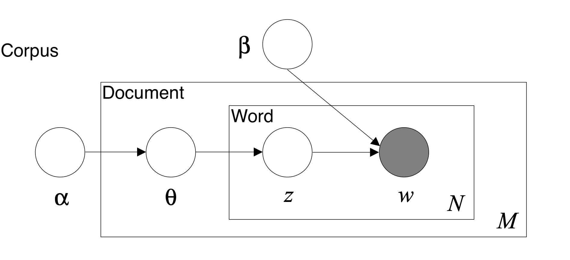
The specific form of topic modeling that we used was Latent Dirichlet Allocation (LDA). An LDA model can be represented by a graphical probabilistic model with three levels as shown in the figure below. The inner level represents the word level where: w denotes a specific word in a particular document, while z denotes the specific topic sampled for that particular word. The middle level represents the document level where: Θ represents the topic distribution for a particular document. The outer level represents the corpus level where: α and β represents the document topic density and the word topic density, respectively. LDA uses a generative probabilistic approach to model each topic as a mixture of a set of words and each document as a mixture of a set of topics.


LDA Visualization


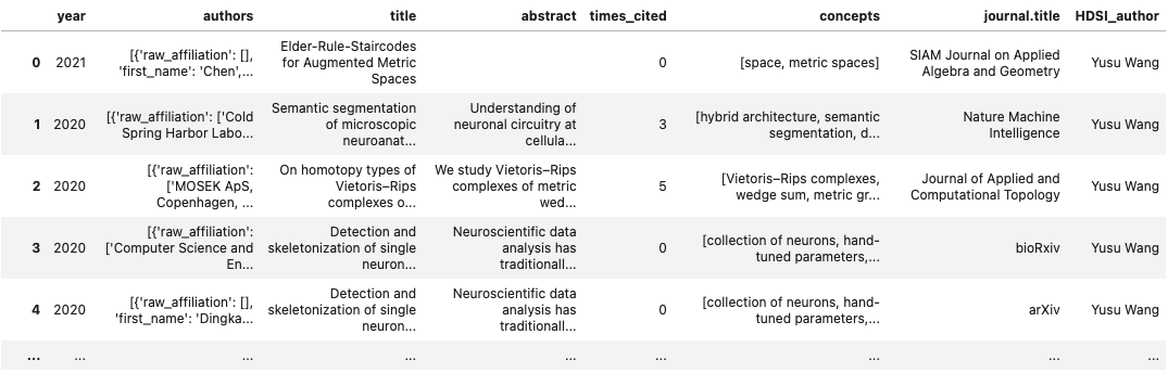
Behind the scenes, the LDA model takes the corpus of texts with the id2word indexes and transforms them into (1) a document topic density matrix and (2) a word topic density matrix by repetitive probabilistic sampling. The document topic density matrix contains the D number of documents as rows and K number of topics as columns. Each row represents the particular probability distribution over the generated topics for that particular document/article. The word topic density matrix contains V rows of unique words and K as the number of columns. Each row of this matrix represents a probability distribution of topics for a particular word. With the two matrices, we are able to generate a list of top terms for each topic ranked by the probability distribution. Additionally, we can extract the dominant topics for each terms by the measures in the document topic density matrix.


As a result, by running the LDA model, we will be able to obtain several matrices:

    (1) word-topic matrix: represents each word with its associated topic distribution
    (2) document-topic matrix:represents each document with its corresponding probability score
    (3) author-topic matrix: aggregates from the document-topic matrices by the authors
    (4) author-year-topic matrix: obtained by further aggregating the author-topic matrix by year

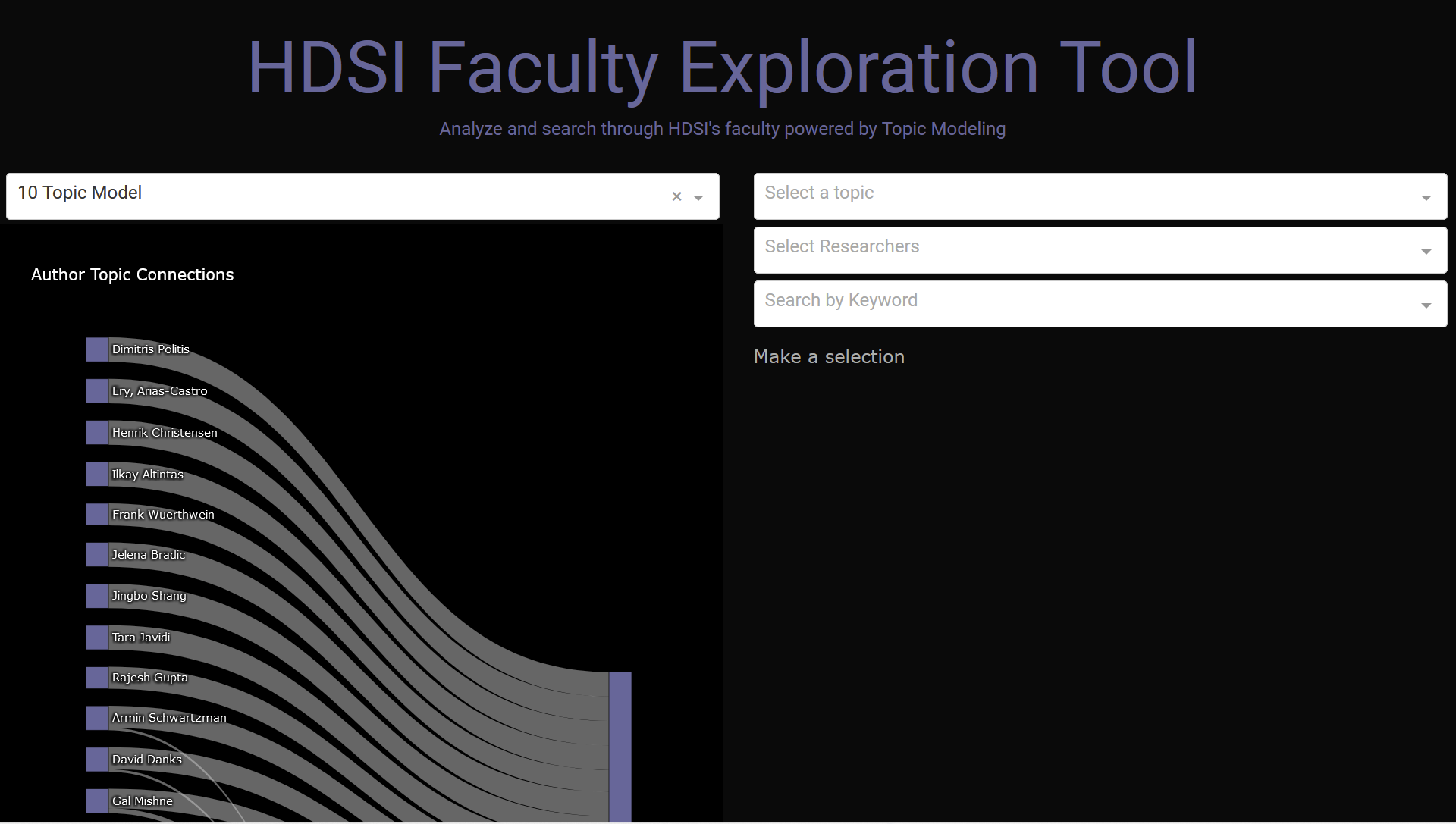
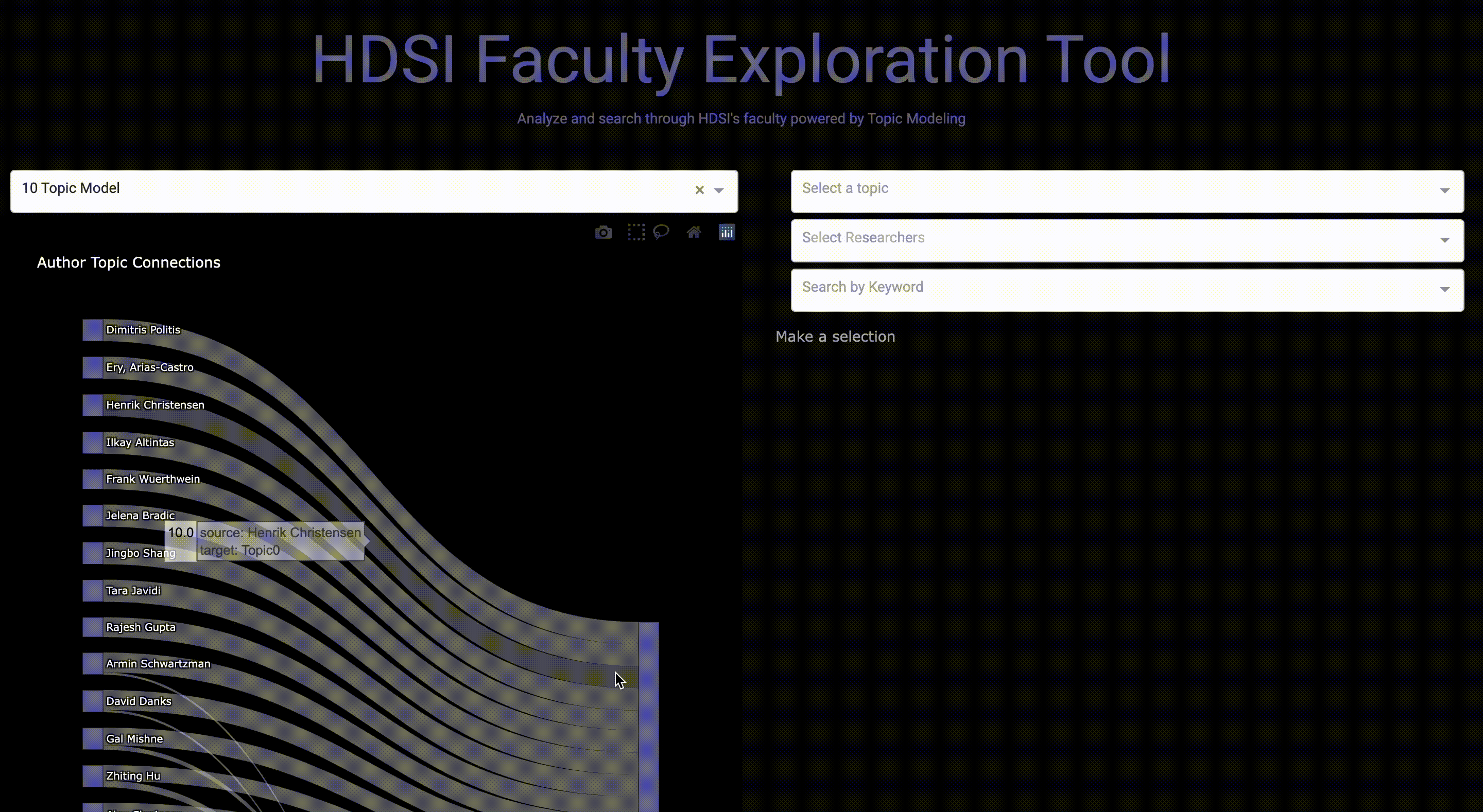
The difficulty lies in deciding the K variable, which in our case is the number of generated topics. Since this is a unsupervised machine learning method, human interpretation is required to account for the qualities of generated topics with different K's. This is why in our final dashboard we decided to include a toggle bar that accounts for different numbers of topics ranging from K = 5, 10, 15, 20, and 30. With this option, future users can interpret the results themselves based on how granular they want the topics to be.


Topic Labeling

Overall, we obtained labels from the LDA model, Dimensions, and Google Scholar to categorize articles and faculty. Below is a short explanation on how we gathered all the labels from these different areas.


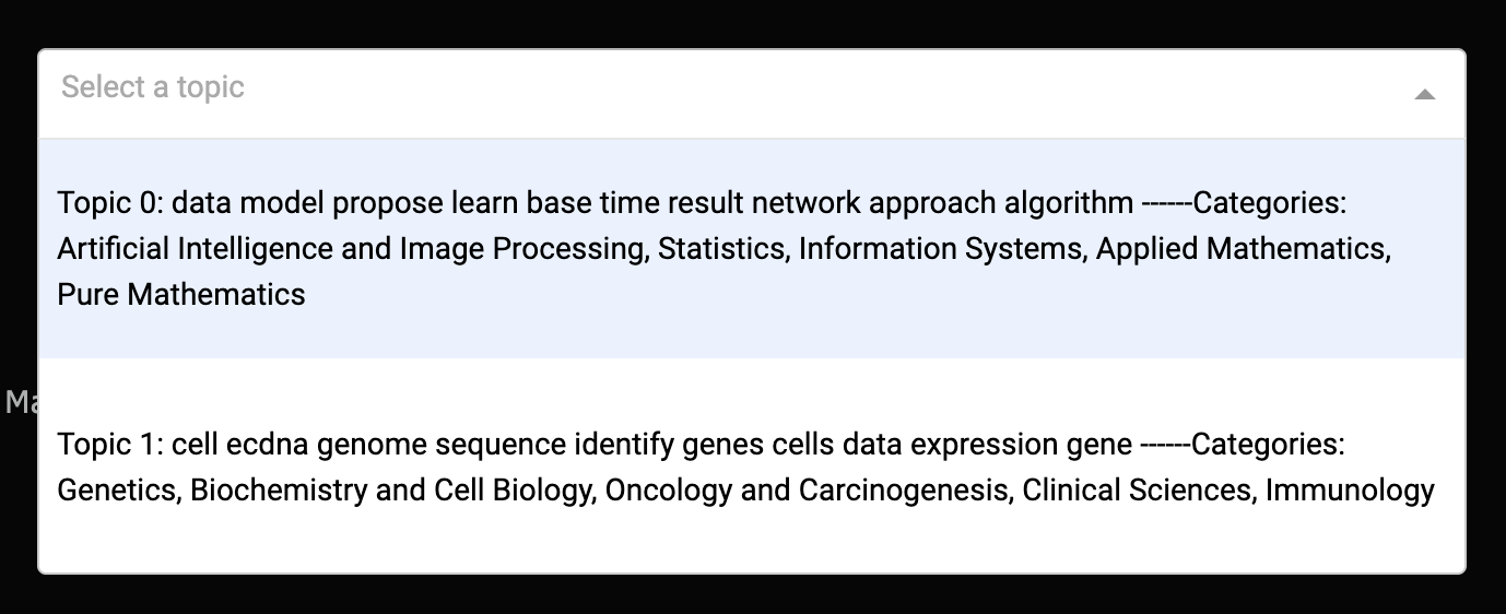
LDA: we used the labels from our trained LDA model to represent our topics. By ranking each word by their topic probabilities, we can get each topic's top relevant words.


Dimensions API: we gathered labels from Dimensions API and combined them with the LDA labels to optimize our labels for topics. So each topic gets the most frequent topic labels aggregated on the topic level.


Google Scholar: we scraped the labels for each researcher from their Google Scholar pages.


Maintaining a Workflow

Since our tool aims to provide the information of faculty members at HDSI to industry partners, we want this tool to always stay updated and robust to changes. Therefore, we designed the following data pipeline that enables updates for our search tool:


  • Data ETL: This part is done through an API call to the Dimensions database to extract the latest faculty publication data.
  • Data Preprocess: This is the first part of the data pipeline which cleans up the retrieved datasets and preprocesses them for the later modeling use.
  • LDA Modeling: The second part of the pipeline is dedicated to the modeling process. Here, developers can modify the configuration to adjust the topic models and explore the topic results.
  • Prepare Dashboard: Based on the selected models, the pipeline will run the appropriate models and generate the necessary files for the use of dashboard.
  • Launch Dashboard: Once all the data and files are ready, the dashboard is ready to be launched.

To look more closely at the data pipeline, please consult our project Github.

Results

In the end we created a tool that allows for future users to explore faculty's work in a very easy and intuitive way. Our Project GitHub Repo gives detailed instructions on how to run the dashboard. We encourage you to go clone the repository and run the dashboard using the command "run_dashboard" in your terminal.


Once you're able to get the address for the dashboard and copy and paste it on your browser, you should see something like the following:


This dashboard includes a Sankey Diagram, a number of topics selection bar on the left, and 3 different search bars on the right for topic number and topic words, researcher and keywords.


On the bar on the left, you are able to select the number of topics you wish to see displayed on the Sankey diagram. A demonstration can be seen below.


On the "Select a topic" bar, you are able to see the topic number along with its associated top words and the related field labels that we have added.


You are also able to select a particular faculty member and all of their published papers will appear along with the topic number they are related too.


Likewise, a keyword search can also be done and the related topics will be presented in similarity order.


Demo

Future Work


While our current dashboard has many useful functions that can offer great use cases for our Industry partners, we also wanted to imagine how we could integrate a more UI focused easy search tool on the HDSI website. So we created a Figma demo demonstrating the features that we are further interested in exploring and testing for a broader target audience, including those who many not be familiar with more advanced data visualizations like the sankey diagram.


Thus our faculty exploration tool resembles a "search bar" aesthetic that matches the current theme of the HDSI website with modern UI aspects and a navy and gold color scheme. The search bar tool will be helpful to explore the array of topics that each of our HDSI faculty members specializes in from microbiology to machine learning algorithms similar to the search by keyword function within our current dashboard.


Our concept further extends to how we want our information to be displayed. So by adding profile pictures that coincide with each faculty member’s name, area of research, and their most relevant publications, our goal is to create a more intuitive layout that provides a greater amount of information within a quick glance. In addition, we also imagined a profile style page that expands upon each faculty member’s publications, abstracts, along with their article level topic, and contact information for easy access to the user. While this is still a work in progress, our next steps would be to further build upon the early stages of implementation using HTML and RxJs with a future goal of integrating our faculty exploration tool on the HDSI website itself which would allow a wider audience to find suitable faculty members depending on what their specific needs are.


Check out the demo of our Easy Search Tool UI below!


>

About Us

Learn a little more about the developers behind this project!


Brian Qian Du Xiang Martha Yanez Siddhi Patel Sijie (Irene) Lu